How to Choose Color Palettes for Khanga Wax Printed Fabric Projects?
Introduction
Choosing colors for khanga fabric projects feels overwhelming. Most buyers fixate on single prints and miss how colors interact across a project. The result? Clashing patterns, visual chaos, and fabric waste.
This guide explains how to build cohesive color palettes for khanga wax-printed projects using color harmony principles, cultural symbolism, and practical planning.
You’ll learn to assess dominant and accent colors, test combinations, avoid common mistakes, and create projects that balance boldness with intentionality.
Understanding Khanga Color Tradition
Khanga fabrics originated in East Africa during the 1800s and feature three defining elements: decorative borders (pindo), central motifs (mji), and Swahili proverbs (jina). The color choices aren’t random—they carry cultural meaning and communicate nonverbal messages.
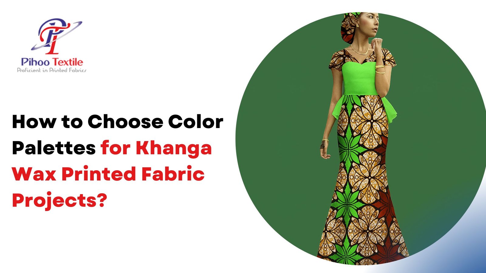
Traditional khangas use vibrant contrasts. Bold primary colors sit alongside intricate patterns and text, creating visual density that demands attention. Unlike minimalist Western textiles, khanga design embraces maximalism as a storytelling device.
Colors often reflect specific occasions. Bright, celebratory tones appear at weddings and births. Darker, subdued palettes mark mourning periods. Understanding this context prevents unintentional cultural missteps when selecting fabrics for projects.
The name “khanga” itself comes from the Swahili word for guinea fowl, inspired by spotted patterns resembling the bird’s plumage. This connection to nature influences many traditional color combinations—earthy browns, sunset oranges, and deep forest greens frequently appear alongside vivid magentas and electric blues.
Key Color Selection Principles
Identify the Dominant Color
Every khanga print has one color that occupies the most visual space. This becomes your anchor. Look at the fabric from three feet away and note which color catches attention first. That’s your dominant shade.
The dominant color dictates what other fabrics, trims, and accessories will coordinate with the project. If working with multiple prints, matching dominant colors creates cohesion.
Extract Accent Colors
Accent colors appear in smaller quantities but add depth and interest. A khanga with dominant cobalt blue might feature yellow geometric shapes and white borders as accents.
Pull one or two accent colors to use in coordinating solid fabrics or contrasting khanga prints. This creates visual connection without overwhelming the eye.
Consider Color Temperature
Warm colors (reds, oranges, yellows) advance visually and feel energizing. Cool colors (blues, greens, purples) recede and appear calming. Mixing temperatures adds dimension but requires balance—too many warm tones create visual aggression, while excessive cool tones feel flat.
Traditional khanga design often pairs warm and cool colors for balance. A fiery orange print might include cool teal borders to provide visual rest.
Drawing Palette Inspiration
Start with the khanga itself. Lay the fabric flat in natural light and photograph it. Use the photo to identify all colors present, including subtle shades in shadows and highlights.
Nature provides reliable color guidance. Sunset combinations (coral, gold, deep purple), forest palettes (moss green, bark brown, sky blue), and ocean schemes (navy, turquoise, sand beige) consistently work because they exist harmoniously in the natural world.
Contemporary fashion offers modern interpretations of traditional palettes. Browse images of khanga styled in current looks to see how designers pair colors. Note which combinations feel fresh versus dated.
Here’s an uncomfortable truth: not every khanga print works for every project. Some patterns are too visually dense for small accessories but perfect for large wrap skirts. Others shine as accent pieces but overwhelm when used extensively. The fabric itself guides appropriate color palette scope.
Testing Color Combinations
Physical swatching beats digital planning. Cut small fabric squares—roughly 2×2 inches—of your primary khanga and any coordinating solids or secondary prints. Pin them together on a mood board or lay them side by side.
View the swatches in different lighting conditions. Natural daylight reveals true colors. Indoor lighting, especially yellow-toned bulbs, shifts how colors appear together. A palette that works in one setting might clash in another.
The 60-30-10 rule provides structure: 60% dominant color, 30% secondary color, 10% accent color. For khanga projects, this might mean a dominant print for the main garment body, coordinating solid for structural elements, and a contrasting khanga accent for trims or pockets.
Walk away from your swatch board for at least an hour. Return with fresh eyes. The combinations that still feel balanced after this break usually work in finished projects.
Common Color Selection Mistakes
Matching too closely creates visual flatness. A red khanga paired with solid red fabric looks monotonous. Instead, pull a secondary color from the print—perhaps the orange in the border pattern—for solid coordinating pieces.
Ignoring scale differences causes problems. Large geometric prints compete with other large patterns. Mix different scales: pair a bold oversized floral khanga with a tightly spaced geometric print that shares common colors.
Polyester-cotton blend khangas often appear shinier and more saturated than 100% cotton versions. These synthetic blends don’t coordinate as well with natural fiber solids. The texture and sheen differences create subtle discord even when colors technically match.
Forgetting about print directionality causes waste. Khanga borders run along all four edges. If the border orientation matters for the design, this affects how much fabric is needed and which colors appear where on the finished piece.
Planning Your Project Palette
Define the project’s end use first. Apparel for daily wear benefits from versatile, neutral-leaning palettes. Statement pieces for special occasions can handle bolder, higher-contrast schemes.
Create a palette hierarchy on paper:
- Primary khanga print (list all visible colors)
- Secondary solid or subtle print (one color pulled from primary)
- Accent khanga or trim (contrasting color from primary)
- Thread color (matches either dominant or accent for visibility preference)
Calculate yardage early. Khanga typically sells in 6-yard bundles at 45 inches wide. Bold prints require more fabric than subtle ones because pattern matching consumes extra material. Don’t underestimate needs.
Making Bold Combinations Work
Color-blocking with multiple khanga prints gained popularity precisely because it handles visual density well. When each garment section features different fabric, the eye processes them as intentional design choices rather than pattern chaos.
Unifying principle: maintain one consistent color thread across all prints. If using three different khangas, ensure all three share at least one common color—even if that color plays different roles in each print.
Solid fabric breaks provide necessary visual rest. Even the most vibrant khanga ensemble benefits from solid-colored elements. Consider solid bindings, solid waistbands, or solid sleeves to break up print-on-print intensity.
Traditional khanga wearing often involves layering two different prints—one as a skirt, another as a head wrap or shawl. This cultural precedent validates bold mixing when done with color awareness.
FAQs
Q: Do I need to pre-wash khanga fabric before planning my color palette?
A: Yes. Pre-washing removes the waxy coating that makes new khanga stiff and glossy. This coating affects how colors appear and how fabric drapes. Wash in cold water with mild soap, then reassess colors after air drying. Some colors may soften slightly, affecting which coordinating shades work best.
Q: Can I mix khanga with non-African prints?
A: Absolutely, but maintain color discipline. Use the color extraction method—pull actual colors present in your khanga and match those exactly in other prints. Scale variation helps: pair large-scale khanga with small-scale florals or geometrics. The cultural origin matters less than visual cohesion.
Q: How do I choose colors for khanga quilting projects?
A: Quilting requires more color variety than garments. Select one khanga as the focal print, then pull 4-5 coordinating solids that match colors within that print. Add one contrasting khanga in a different scale for visual interest. Test blocks before cutting all pieces—quilts show color relationships more intensely than clothing.
Q: Are certain color combinations considered inappropriate in khanga culture?
A: Specific meanings vary by region, but generally, heavily black-dominated khangas relate to mourning periods. Very bright, celebratory combinations suit weddings and festivals. If creating garments for cultural ceremonies, research regional color protocols or consult community members to avoid unintended messages.
Q: Why do my khanga colors look different after sewing?
A: Lighting and context shift color perception. The same khanga that looked vibrant folded on a shelf may appear different when sewn into a garment and worn against skin tones. Thread color, seam lines, and surrounding colors all influence how the eye reads the final palette. This reinforces the importance of physical swatching in intended lighting conditions.
Q: Should I choose colors based on skin tone or personal preference?
A: Both matter. Traditional khanga wearing prioritizes cultural and social messaging over skin tone matching. However, modern fashion applications can consider complementary colors—warm undertones often suit warm palette khangas, cool undertones pair well with cool-based prints. Personal confidence in wearing bold colors ultimately matters most.
Conclusion
Choosing color palettes for khanga projects requires understanding cultural context, analyzing dominant and accent colors, testing combinations physically, and planning with the end use in mind. The most successful palettes balance boldness with intentional color relationships that create visual harmony rather than chaos.
Start with one dominant print. Build outward methodically. Trust the swatching process.
Pihoo Textile curates authentic khanga and wax-printed fabrics with careful attention to color quality, print clarity, and cultural authenticity. Our collection features traditional East African khangas with vibrant borders and meaningful proverbs alongside contemporary wax prints in diverse color palettes.
Each fabric is 100% cotton—no polyester blends that create color-matching problems. We provide accurate color representation in our product photography and detailed descriptions of dominant and accent colors to help with palette planning before purchase.
Visit pihootextile.com to explore khanga fabrics organized by color family. Find coordinating prints, solids, and accessories that simplify palette selection. Build projects with colors that work together from the start.
